In a life long before aeroplanes, I was involved in the world of corporate and stakeholder communications. As a result, I developed an interest in company logos, colours and type faces. It would be easy to consider this all a matter of superficial ‘look’ and ‘image’ which is the obsession only of corporate design agencies and of relatively little interest to actual business users. However, as I have learned, logos, colours and typefaces can have quite an influence on customers and others – particularly if you want to build familiarity and ‘brand recognition’.
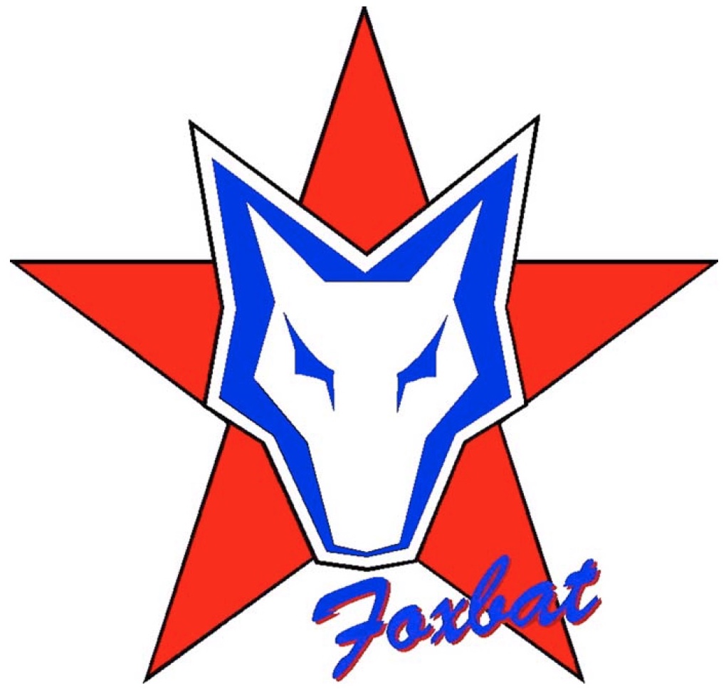 When I brought the first Foxbat to Australia in 2001, it was adorned with the logo of the UK distributor – a red star with a stylised fox head and the script ‘Foxbat’ written at an angle across the bottom right corner. But why ‘Foxbat’ and what’s the red star all about?
The answers are simple, if a little mixed up in intent. The aircraft was christened a ‘Foxbat’ by the then UK agent – Gordon Faulkner – in a slightly misguided but in the event very memorable reference to the mach 3+ MIG-25 jet fighter, which the USA military codenamed ‘foxbat’. I say slightly misguided, as our Foxbat is actually built not in Russia, like the MiG, but in Ukraine. The red star is also very cold-war Russia, quite unlike the bright blue and yellow colours of Ukraine, which represent the clear sky and ripening wheat for which the country is famous.
However, I quite liked the original Foxbat logo and Gordon agreed I could use it, so it adorns the tails of all the original 45 or so 450kgs gross weight A22L aircraft delivered in Australia.
 When the factory announced the 600kgs gross weight A22LS (Light Sport) version, I wanted to differentiate it from the original lighter weight A22L aircraft. From a distance of a few metres, the A22L and A22LS look pretty much identical, and the signature yellow paint continued, so one obvious way was to change the logo. After discussions with a local designer, I decided to drop the red star and the ‘Foxbat’ script and use only the fox head symbol. In fact, this was subliminally sharpened up to make it look more aggressive and, in a distant gesture to the red star, I changed the colours to red and black.
 This new ‘red’ logo was applied to the first few A22LS aircraft – until someone ordered a red one, and the red fox head on the tail just didn’t look right! At the same time, I experienced a couple of misunderstandings about the colour of the registration numbers/letters on the fuselage sides. These are required to be of sufficient contrast to make them easily distinguishable, so I had been using black letters or numerals. All OK on yellow & white aeroplanes but almost invisible on red and blue ones. The designer came to the rescue and we agreed on silver letters and numerals, with a black shadow – which made them easy to see on all aircraft colours. To co-ordinate with the registration colours, I changed the fox head logo on the aircraft to black, white and silver.
 In mid-2015 the factory announced the new, fast cruising A32. Many people were happy for this to still be called a Foxbat but, clearly, this was quite a different aeroplane – both to look at and to fly. After much agonising, I finally decided to go with’ Vixxen’ – again, more aggressive, with the extra ‘x’ added to make it a bit more memorable. And so the logo received yet another make over, hopefully to align it with the name. The silver elements were changed for black and the eyes were changed to red, for some eye-candy appeal.
 Finally, about 18 months ago, the factory agreed to our suggestions to build an aircraft aimed at appealing to Australia outback landowners and pilots. We added a heavy-duty metal luggage bay with a side door, fat tyres with mud guards, a siren, a UHF radio and a bigger climb prop as well as a couple of other additions. But what to call this aircraft? We decided to be a bit more adventurous than ‘Foxbat Farmer’ and the like. In the end, our sales and service support partners – Cleveland Bay Aviation in Townsville – came up with ‘Kelpie’. This name has a bit more going for it than ‘Dingo’ or ‘Wombat’, suggesting hard work and ruggedness, developed for Australian conditions. And so the latest in a line of logos was born – a bit whimsical but a a bit of fun too. Maybe it’s a combination of the original fox head and a touch of Scooby Doo, ‘well friendly’ as my grandson would say.
So that’s a potted history of our Foxbat Australia aircraft logos. I’ve stayed away from typefaces and, to a large extent, colours, which could be the subject of several volumes in themselves.
And now we are working on a completely new logo…for something completely new in 2018. And it’s absolutely nothing like a fox head! Watch this space.
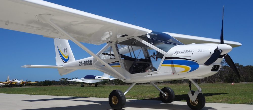
Pleeease tell me the factory is about to release a tail-dragger stick Vixxen !
I wish!
In the example above, the curvey “Foxbat” was not congruent with the agressive star and fox-bat. They also clashed. Very good idea to get rid of the text. The logo is better without the star behind it, also.
You have done a fantastic job with the marketing. It is a credit to you. The website (and colour of the airplanes) for other aircraft pale in comparison.
Very interesting read – Much more going on behind the scenes it seems!
Thanks for sharing. So where did the name “Vixxen” originate then?
In the USA, they seem to call the A22 the “Valor.”
Hi Warren, the name ‘Vixxen’ came up during some discussions in Australia about a name for the new A32 – basically because it related to foxes and suggested a bit more ‘bite’. It doesn’t relate to the old ‘Valor’ name which was used in USA a while back.